URL: rewiredstate.org/projects/what-makes-a-centre
We previously blogged about helping to create a prototype SMS text message service for the Government’s UK Online Centres. The centres help people get online for the first time, and are a key part of the government’s strategy for Digital Engagement.
We also worked on a handful of data visualisations to highlight the hidden aspects of the centres. These could assist in making decisions about outreach or marketing, or on the balance of facilities on offer to customers of the service. To create them, we prepared different slices of the UK Online dataset, and passed them through the wonderful Wordle web service:
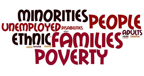
Centres’ target audience:
The visualisation at the top of this article shows the words that individual centres use to describe their own target audience.
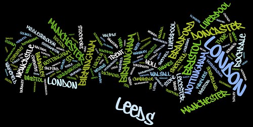
Centre locations:
This shows the relative proportions of centres in different parts of the country.
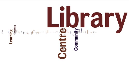
Centre names:
This shows trends in the names of the different centres. Clearly, most of them are in libraries and community centres.
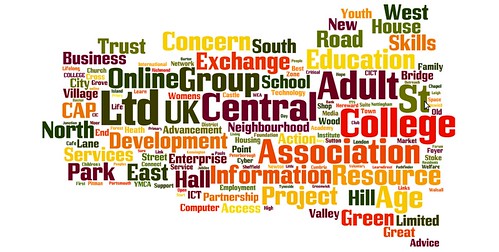
Centre names (minus the six most popular words):
This final visualisation shows all but the most common six words in the names of the centres (i.e. without “library”, “centre”, “community”, “learning” and “training”).


One Comment
Thrilling! Very interesting information on data visualisations. Come in use with my knowledge