Peter Cook is a software developer from Lewes, East Sussex. Here, he writes about visualising the topics that interest people when they mark themselves as attending our developer meetup, Async. Peter will be speaking at Async in January on using the data visualisation toolkit, D3.js
During the summer months of 2012, the Lab for the Recently Possible held three Data Visualisation Lab Days in which a group of artists, programmers and other interested parties met up to create and experiment with data visualisation.
Amongst the topics explored were:
- managing call-centre data from Age UK
- domestic energy consumption
- attacks on migrants in Athens, Greece
Prem was keen to explore different ways of visualising and presenting attendance data from the series of regular talks on JavaScript called Async. To help us with this, he supplied data from the Lanyrd website containing vast quantities of information of who’s attended which sessions and what topics were covered in those sessions.
I took on this challenge and looked at a couple of ways of visualising this data. Both of the resulting visualisations show how many people attended sessions of a given topic (e.g. front-end, architecture, games).
Heat Matrix
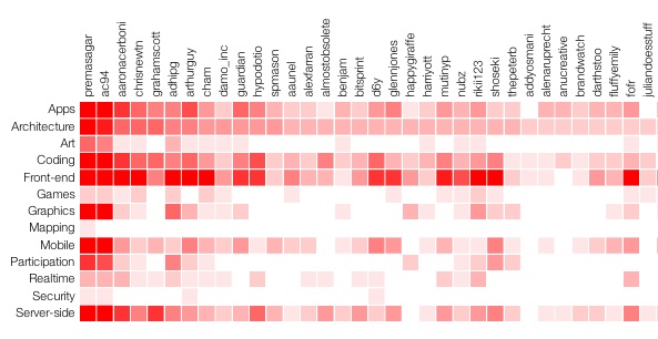
My first visualisation is a ‘heat matrix’, which is a grid of squares coloured or shaded according to a given value. In this case, each row represents a topic and each column an attendee. The darker the value, the more times that attendee has been to a talk of that topic.
The rows and columns can be sorted by clicking on their titles. For example, if you want to ascertain someone’s favourite topics, click on their name and their topics, ranked by attendance, will be shown.
Implementation
I chose to use the D3.js JavaScript library for this as it is geared towards this sort of visualisation. Loosely speaking, the attendance values are represented as a 2×2 array and this data is bound to DOM elements, specifically SVG rectangle elements. D3 facilitates the creation of the rectangle elements from the data array and also makes the shading of them based on frequency of attendance very straightforward.
Avatars ranked by attendance
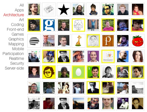
The second visualisation has a friendlier look as it uses the avatars of the attendees and lists them in order of attendance, according to a chosen topic.
The user can click on a topic and all the attendees of that topic’s sessions are displayed with the most frequent attendee listed first.
We also thought it’d be interesting to show whether any attendees have a stronger interest in a particular topic. For example, has anyone visited only graphics sessions? This probably indicates that they have a strong interest in graphics. We did this by computing each attendee’s favourite topic, attaching this to the attendee’s data and surrounding their avatar with a yellow border.
Implementation
As with the first visualisation, I used the D3 library as this is another application where data is bound to DOM elements. In this case, a one-dimensional array of attendee objects (containing avatar URL, name, favourite topic etc.) is bound to a selection of image elements. Many examples of D3 visualisations employ SVG but this is an example that operates on common HTML elements.
Wrap up
It was interesting to work on two different visualisations of essentially the same dataset. The first was a more obvious idea but it’s not particularly visually appealing and arguably displays more than is necessary. Having said that, it is useful for looking up a particular user to see what their favourite topics are. The second I think simpler, more friendly and easier to understand.
(This post first appeared on Peter’s blog)


