Chris Newton is a web developer currently living and working in Brighton. Chris was one of our Summer 2012 interns and during his time with us he built the social web tool, Elsewhere.
URL: elsewherejs.com
Elsewhere is a social graphing tool built to replace the Google Social Graph after its unfortunate demise in April 2012. Elsewhere can help you locate peoples’ social media profiles as well as web sites they contribute to, simply by providing it with a URL to one of those profiles.
You can have a play with the Elsewhere explorer at example.elsewherejs.com
For example, for the start URL http://lanyrd.com/profile/chrisnewtn, Elsewhere finds this network of profiles that belong to the same person:
-
 Chris Newton’s conference talks and presentations | Lanyrd
-
 Chris Newton (@chrisnewtn) op Twitter
-
 Chris Newton
-
 Chris Newton – Google+
 -
 chrisnewtn (Chris Newton) · GitHub
-
 newt42’s Music Profile – Users at Last.fm
-
 Flickr: chrisnewtn’s Photostream
-
Flickr: chrisnewtn
At its heart, Elsewhere is a simple web crawler that scans a page at a URL for links that have been marked up with the a simple piece of HTML called a microformat – in this case, the rel="me" microformat, from which Elsewhere can tell that the page at that link is owned by the same individual or organisation that owns the page the link is on. Once Elsewhere finds such a link on the page, it scans the page at that link for more rel="me" links and so on and so forth.
At the end of this process, a list of URLs has been collected with the connections between them recorded. Next comes the clever bit, validation. As you might guess, there’s a problem with assuming that a page that’s been linked to is owned by the same person as the page the link is on. You could put a link on your site to barackobama.com claiming you owned it and with no validation, Elsewhere would just take your word for it.
With validation however, every page that is scanned for links is checked to ensure it links directly or indirectly back to the original page. Here’s a diagram of what that looks like:
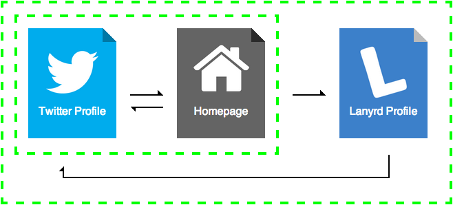
The entry point here is the Twitter profile. This profile links to its owner’s homepage, which in turn, links back to his or her Twitter profile, thus completing a loop and creating a valid graph. You can run Elsewhere without validation too, as some legitimate connections may be otherwise lost, but it is possible that you can get some junk in your graph without validation.
Elsewhere isn’t specifically a social media grapher, there’s no code in the program for special cases where a social media site links to a profile and does not use rel="me" codes. Elsewhere also does not consider any site’s API. If you’ve linked your profiles together by, let’s say, signing into Lanyrd with Twitter, Elsewhere won’t have a clue. If there isn’t a link on a page marked up with rel="me", Elsewhere is completely blind.
This strict, single focus of Elsewhere does has a privacy side benefit. Since the only way to determine ownership is by following links and since the placement of those links is at the discretion of the person who owns their web presence. If that person doesn’t place the links on their profiles and websites, then there’ll be nothing for Elsewhere to see. Elsewhere’s ability to map a person’s web presence is made possible entirely by this consent.
Elsewhere doesn’t attempt to be a full suite of tools to map peoples’ web presence. It’s just a simple app that will give you a trustworthy graph if the links are there to find. It can be used as part of a wider toolset. A good example of this is Ident Engine, a tool by Glenn Jones that provides a high-level overview of a person’s web presence. Ident Engine makes use of Elsewhere in addition to the extensions elsewhere-mapper and elsewhere-profiles. I’d highly recommend checking it out.
I’ve had a lot of fun building and maintaining Elsewhere over the past couple of years and I hope you’ll find it fun to use and a useful addition to your tool chest.