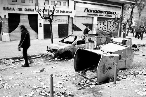
Jaya Brekke is a photographer, filmmaker, designer and researcher, currently exploring the social impact of the economic crisis in Greece. She took part in one of our recent Data Visualisation Lab Days, where we brought together a melting pot of designers, programmers and people working in social projects. We wanted to build visual, interactive tools that make use of real world data to help elucidate problems and facilitate change. For a different take on the Lab Days, see Peter Cook’s energy visualisation.
It is too rare of a privilege to be able to spend an entire day with programers, geeks, charity workers and artists where everyone could share ideas and problems with each contributing solutions on how best to communicate and handle large amounts of data. The Data Viz Lab Day at the Lab for the Recently Possible was one such rare occasion, and I was immediately excited about the prospect of participating as I was about to embark on a research project in Athens in which I wanted to use data visualisation for gathering and analysing data about the financial crisis.
I came to the day with one specific idea in my mind: to have an interactive map of the increasing violent attacks against migrants in Athens. I wanted the map to be open for the people to contribute anonymously, as most attacks are currently not reported because of fear of the Greek police, which have a reputation of being racist and very violent. Making visible these hidden consequences of the crisis is a very important activist intervention into a debate that is still dominated by a financial discourse in which human and environmental costs are invisible.
I am a designer and researcher with very limited coding experience and not particularly experienced in handling data sets. So I had absolutely no idea where to even start with developing such a map, what the best way is to structure your data, and what the various elements and tools are for (online) data visualisation. With me on the day I had brought data gathered from a Human Rights Watch report on attacks in Athens, as well as information from blog.occupiedlondon.org.
We started the day with a simple go-around of who we were and why we had come, which gave me the chance to explain my idea. From there I got suggestions and help to structure my data very simply using Google Spreadsheets, learning about the various file formats that are computer-readable, and breaking down my idea into the various elements that needed to be worked on: the data structuring, data-gathering through text messages, email or phone calls, and the actual mapping and visualising, using the Google Maps API and tile overlays. The group then split into various sub-groups working, some working on other projects, and some working on various elements of my map project.
The day was hugely useful for me to get an overview of data visualisation and mapping. At the end of the day we had a look at Ushahidi who, it turned out, have created tools that were perfectly suited to my needs, and they are also more inline with the values of my research project than the google tools I had been using, as they are a non-profit, free and open source company. While my Athens research project, The City at a Time of Crisis, is still in its start up phase I am looking forward to using the knowledge and tools that I got a taster of during the data viz workshop to visualise the hidden everyday experience of the financial crisis, as well as the complete restructuring of European welfare states.
