Peter Cook is a software developer from Lewes, East Sussex. Here, he writes about visualising the topics that interest people when they mark themselves as attending our developer meetup, Async. Peter will be speaking at Async in January on using the data visualisation toolkit, D3.js
During the summer months of 2012, the Lab for the Recently Possible held three Data Visualisation Lab Days in which a group of artists, programmers and other interested parties met up to create and experiment with data visualisation.
Amongst the topics explored were:
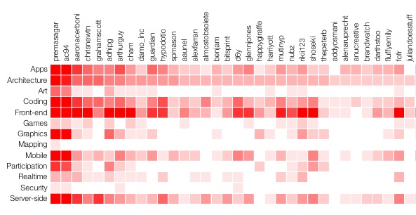
Prem was keen to explore different ways of visualising and presenting attendance data from the series of regular talks on JavaScript called Async. To help us with this, he supplied data from the Lanyrd website containing vast quantities of information of who’s attended which sessions and what topics were covered in those sessions.
I took on this challenge and looked at a couple of ways of visualising this data. Both of the resulting visualisations show how many people attended sessions of a given topic (e.g. front-end, architecture, games).
Heat Matrix
My first visualisation is a ‘heat matrix’, which is a grid of squares coloured or shaded according to a given value. In this case, each row represents a topic and each column an attendee. The darker the value, the more times that attendee has been to a talk of that topic.
Read More »
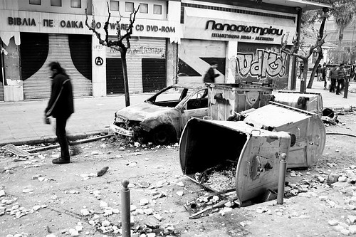
Jaya Brekke is a photographer, filmmaker, designer and researcher, currently exploring the social impact of the economic crisis in Greece. She took part in one of our recent Data Visualisation Lab Days, where we brought together a melting pot of designers, programmers and people working in social projects. We wanted to build visual, interactive tools that make use of real world data to help elucidate problems and facilitate change. For a different take on the Lab Days, see Peter Cook’s energy visualisation.
It is too rare of a privilege to be able to spend an entire day with programers, geeks, charity workers and artists where everyone could share ideas and problems with each contributing solutions on how best to communicate and handle large amounts of data. The Data Viz Lab Day at the Lab for the Recently Possible was one such rare occasion, and I was immediately excited about the prospect of participating as I was about to embark on a research project in Athens in which I wanted to use data visualisation for gathering and analysing data about the financial crisis.
I came to the day with one specific idea in my mind: to have an interactive map of the increasing violent attacks against migrants in Athens. I wanted the map to be open for the people to contribute anonymously, as most attacks are currently not reported because of fear of the Greek police, which have a reputation of being racist and very violent. Making visible these hidden consequences of the crisis is a very important activist intervention into a debate that is still dominated by a financial discourse in which human and environmental costs are invisible. Read More »